East Coast Game Conference 2014 Presentation

Late last month marked the sixth year of the East Coast Game Conference (ECGC), where game developers gather to share ideas, explore the latest trends in the industry, and otherwise blow each other up (virtually) in increasingly creative ways. While it technically is all fun and games, this conference provides an environment for designers, developers, educators, industry veterans, startups and aspiring game makers to exchange ideas, challenges, and solutions.
Each year, I’ve always been impressed with the conference speakers and their wide-ranging topics, because the techniques, design approaches, and production processes can be applied to many other disciplines.
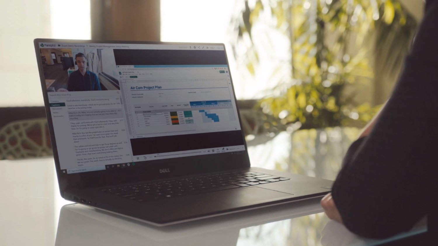
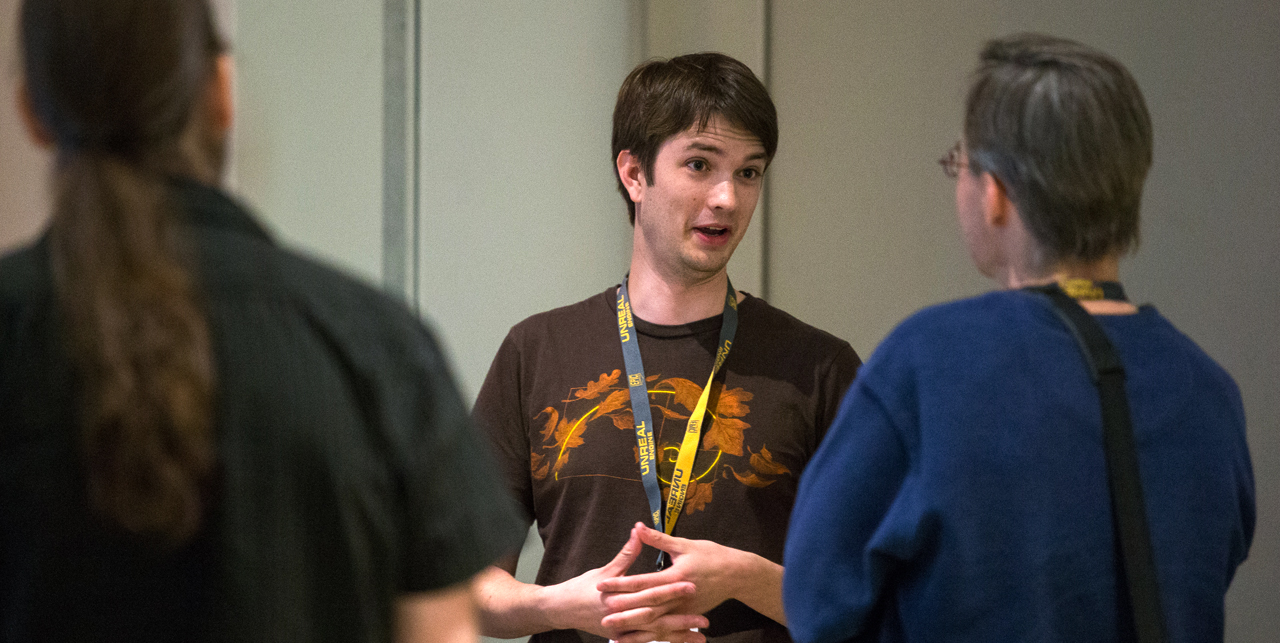
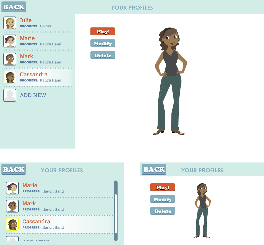
This year was a bit different for me, however, because I was finally able to contribute back to this community with a talk about multiplatform design and development, drawing from my experience at DELTA and work on The Mane Event!
But what do I mean when I say “multiplatform development”? Like many industries, game development has been hit with the same wave of mobile device users who expect content to conform to their screen of choice and behave appropriately. Although game developers also have to contend with different console manufacturers, I crafted my talk around developing simultaneously for web browsers and mobile devices (apps). The end goal is to create the perfect user experience–regardless of device–and make it look like you built your application specifically for a given device.
As you may imagine, this is seldom a cakewalk, and it can introduce a lot of design and conceptual challenges: what if the user is on a smartphone with a resolution higher than a laptop, that has a single-core processor with a quarter the memory of a desktop, and is likely to only play for two minutes at a time?
Without trying to scare attendees away with doom and gloom railings against mobile devices, I attempted to break down the challenges into a couple of categories and address the kinds of questions that need to be asked at every stage of design and development. My hope was to share tangible nuggets of knowledge that could better inform anyone addressing multiple platforms.
Here are some of the tidbits I shared:
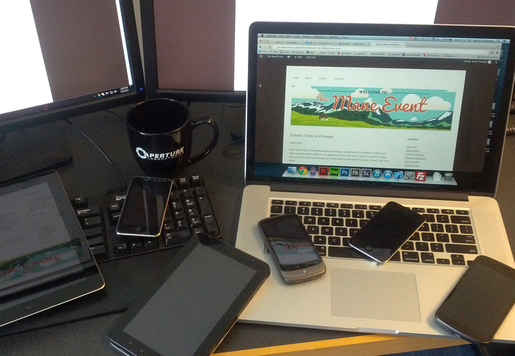
Screens and Scaling
One of the biggest and most apparent challenges has everything to do with screens–how they vary in physical size, resolutions and pixel density. Does it make sense to create a button that is 60 pixels square, when on one screen it’s the size of a quarter, and on another it’s the size of a hole punch?
This kind of discrepancy tends to drive traditional designers crazy, because ultra-high-density displays make pixel-based measurements nearly meaningless (and certainly very, very tiny). To account for this, it’s better to measure screen elements in either percentage-based sizes (e.g., half of the screen), or in real-world values like inches (which can be computed if you know the screen’s pixel density). Real-world measurements are best used to measure elements that humans interact with–after all, a person’s fingers don’t scale up or down as screen sizes change.
Another approach is to rearrange layout on devices of different sizes, borrowing pages from progressive enhancement, responsive design, and fragments. For instance, when dealing with a two-panel interface, it may make sense to place or order pages differently on a large screen versus a small one.
Trickier than user interface (UI) and screen sizes, user behavior and human computer interaction are fields unto themselves, and they offer perspectives that can help developers better understand the context in which people access their content. One of my examples explored how touchscreens can make icon placement difficult when compared to traditional web environments with mouse cursors. Not only do you have to take into account where the user may be gripping the device, and the range of movement they have, but also that human hands, unlike mouse pointers, aren’t transparent and can obscure onscreen content during interactions.
During my presentation, I tried to slowly reveal looming questions about scaling designs, suggesting that it doesn’t always make sense to recreate a desktop game or application on a smartphone screen. Rather, it’s a better practice to put yourself in the user’s shoes and ask how the user’s expectations will scale depending on device. A user sitting at home on a desktop website will want all the functionality necessary for extensive work or gaming, whereas a user between meetings on a smartphone may just want timely reminders, quick decisions and actions, or a moment of escapism. Thinking about these settings from the outset can often create fragmented but ultimately more appropriate experiences on each device.
Testing
When testing, nothing beats using actual devices–and using a variety of them, when possible. This gives you the most accurate presentation of performance you’ll get, and it helps identify problems early on, before they have time to fester. To this end, it can save time to categorize devices by ease of deployment (how long does it take to test), popularity (what percent of users have the device), and trouble-making (if a popular device habitually misbehaves, it becomes your go-to testing device). This lets you prioritize for testing during development.
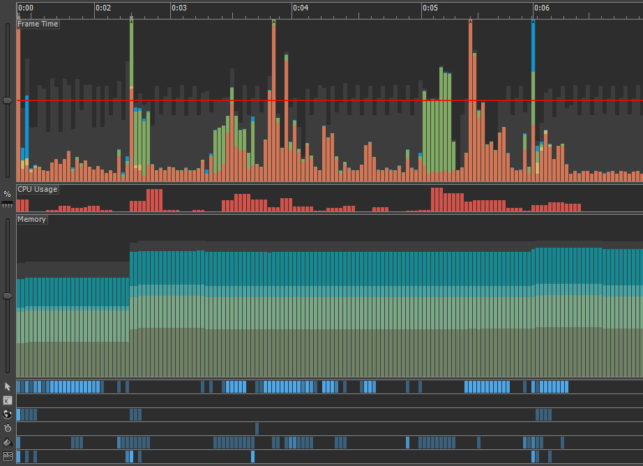
Having the right tools available to profile performance can make a huge difference as well, particularly by making bug hunts much more effective and less time-consuming. We used Adobe’s Scout application to monitor things like frame rate, memory usage, and running code in real time.
A final note on testing: it’s important for developers to realize that we innately protect our creations and tend to go easy on them. It pays to have colleagues who excel at and delight in breaking things to review your work, because it’s always better to find an issue internally than to find it out in the wild!
Wrapping Up
Although this conference and the talk itself were clearly geared towards game development, I’ve always found that the lessons learned at ECGC are applicable to different disciplines and environments. Multiplatform development shakes hands with user experience, user behaviors, interface design, and content consumption. It forces us to ask the same questions as we do when developing web sites, systems and courses. From a broad perspective, gaming and education share common ground in which understanding the user is vital to creating engagement and retention. With this perspective and the right application of design and technology, it’s easy to envision a future where play and learning go hand in hand.
Game on!